<style type="text/css">
.rotatey_a{
-webkit-transform : rotate3d(1, 1, 1, 30deg);
-moz-transform : rotate3d(1, 1, 1, 30deg);
-ms-transform : rotate3d(1, 1, 1, 30deg);
-o-transform : rotate3d(1, 1, 1, 30deg);
transform : rotate3d(1, 1, 1, 30deg);
}
.rotatey_b{
-webkit-transform : rotate3d(1, 1, 1, 45deg);
-moz-transform : rotate3d(1, 1, 1, 45deg);
-ms-transform : rotate3d(1, 1, 1, 45deg);
-o-transform : rotate3d(1, 1, 1, 45deg);
transform : rotate3d(1, 1, 1, 45deg);
}
.rotatey_c{
-webkit-transform : rotate3d(1, 1, 1, 180deg);
-moz-transform : rotate3d(1, 1, 1, 180deg);
-ms-transform : rotate3d(1, 1, 1, 180deg);
-o-transform : rotate3d(1, 1, 1, 180deg);
transform : rotate3d(1, 1, 1, 180deg);
}
.rotatey_d{
-webkit-transform : rotate3d(0, 0, 0, 45deg);
-moz-transform : rotate3d(0, 0, 0, 45deg);
-ms-transform : rotate3d(0, 0, 0, 45deg);
-o-transform : rotate3d(0, 0, 0, 45deg);
transform : rotate3d(0, 0, 0, 45deg);
}
.cadreexemple:hover .transition-rotate3d{
-webkit-transform : rotate3d(1, 1, 1, 360deg);
-moz-transform : rotate3d(1, 1, 1, 360deg);
-ms-transform : rotate3d(1, 1, 1, 360deg);
-o-transform : rotate3d(1, 1, 1, 360deg);
transform : rotate3d(1, 1, 1, 360deg);
}
.transition-rotate3d{
-webkit-transition-property : -webkit-transform;
-moz-transition-property : -moz-transform;
-ms-transition-property : -ms-transform;
-o-transition-property : -o-transform;
transition-property : transform;
-webkit-transition-duration : 5s;
-moz-transition-duration : 5s;
-ms-transition-duration : 5s;
-o-transition-duration : 5s;
transition-duration : 5s;
-webkit-transform : rotate3d(1, 1, 1, 0);
-moz-transform : rotate3d(1, 1, 1, 0);
-ms-transform : rotate3d(1, 1, 1, 0);
-o-transform : rotate3d(1, 1, 1, 0);
transform : rotate3d(1, 1, 1, 0);
}
/* Mise en page */
.cadreexemple{
width : 150px; border : 1px solid #ccc; margin-left : 15px; padding : 5px
}
.rotate{
-webkit-transform-origin : 50% 50%;
-moz-transform-origin : 50% 50%;
-ms-transform-origin : 50% 50%;
-o-transform-origin : 50% 50%;
transform-origin : 50% 50%;
height:100px; width:100px; border:1px solid #1e6001;
}
</style>
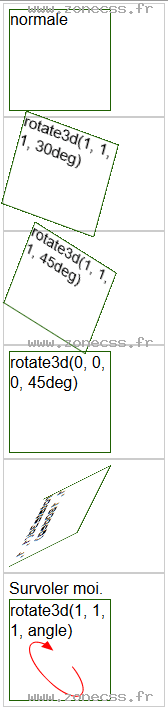
<div class="cadreexemple">
<div class="rotate">normale</div>
</div>
<div class="cadreexemple">
<div class="rotatey_a rotate">rotate3d(1, 1, 1, 30deg)</div>
</div>
<div class="cadreexemple">
<div class="rotatey_b rotate">rotate3d(1, 1, 1, 45deg)</div>
</div>
<div class="cadreexemple">
<div class="rotatey_d rotate">rotate3d(0, 0, 0, 45deg)</div>
</div>
<div class="cadreexemple">
<div class="rotatey_c rotate">rotate3d(1, 1, 1, 180deg)</div>
</div>
<div class="cadreexemple">
Survoler moi.
<div class="transition-rotate3d rotate">rotate3d(1, 1, 1, angle)</div>
</div>